How much macro can you explain in one graph?
Macro is hard; here is an attempt to make it easier. I will try to explain as much of macroeconomics as possible with a single graph. Dynamic AS/AD is pretty good, but I think we can do some interesting things by turning to portfolio theory.

Macro is and always has been about investment. Keynes noted that investment is much more volatile than consumption, which is why his consumption function has a positive intercept and a slope of less than 1. So to explain macroeconomic fluctuations, we have to explain investment.
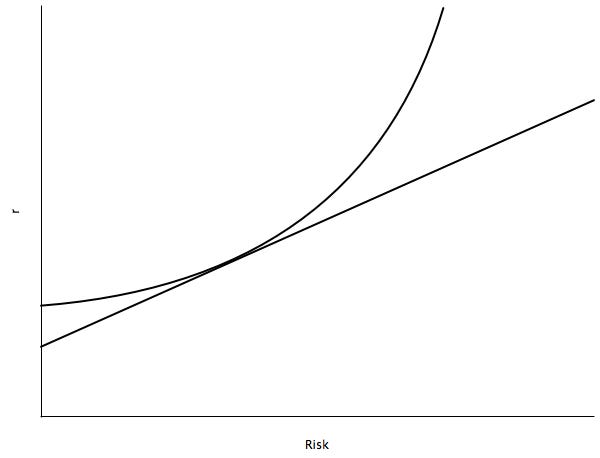
The graph that I’ve chosen to explain most of macro is a standard one from finance. The straight line (called the capital allocation line) shows investment options. Investors can select low-risk, low-return projects or high-risk, high-return projects. When capital markets are efficient, the line is going to be perfectly straight, but that’s not super-important under ordinary conditions. The indifference curve represents the preferences of an investor. When investors are highly risk-averse, their indifference curves are going to be relatively steep. When they are more risk-neutral, their indifference curves will be flatter. The tangency represents the portfolio selection of the investor.
We have done enough work now to shed light on the concept of animal spirits. What happens when an exogenous shock makes investors more risk-averse? Their indifference curves get steeper and they become less willing to bear risk in their portfolios. As a result a number of investment projects with high returns do not get funded, and total returns and therefore total output in the economy go down. Of course, it need not be an exogenous shock; regime uncertainty will also make investors more risk-averse, decrease total risk-taking, and decrease expected output.
That’s it for the indifference curve; let’s now turn to the capital allocation line. The slope of the line measures the incentive to bear a marginal unit of risk. If there is not enough risk-taking in the economy, the government can try to stimulate risk-taking by increasing the slope of the capital allocation line. It can do this in two ways, either by lowering the return to low-risk projects or by raising the return to high-risk projects.
Lowering the return to low-risk projects is usually called monetary stimulus. One very low risk project is to hold cash or Treasuries. Monetary stimulus lowers the return to holding cash by creating inflation. Since the real return to cash is lower, people substitute Treasuries for cash, lowering the real rate of return on Treasuries. Other low-risk investment projects, which are close substitutes for cash and Treasuries, will also experience decreases in real returns in proportion to how close of a substitute they are—that is, how riskless they are. As a result, the slope of the capital allocation line increases, and investors take on more risk than they would without the stimulus.
Fiscal stimulus attempts to raise the return to high-risk projects. The government subsidizes projects that are not close substitutes for holding cash and Treasuries. Like monetary stimulus, it makes the capital allocation line steeper, though it works from the other end of the line.
We have good reason to think that monetary stimulus is superior to fiscal stimulus. Under monetary stimulus, the projects that bear the additional risk are selected by investors. Under fiscal stimulus, the government selects the additional risk-bearing projects. If you believe, as I do, that investors are better at selecting the investment projects to bear the marginal risk than the government, you should prefer monetary to fiscal stimulus.
What happens when the government, through monetary or fiscal stimulus, makes the capital allocation line steeper than it ought to be? Investors take on lots of risk. This can increase total returns and total output, but if the risks that investors are taking are correlated, then you can have a quasi-Austrian boom/bust cycle. Investors, though individually rational, collectively become irrationally exuberant because the price of risk is wrong. On expectation, returns are higher because of the additional risk. But every so often the risk goes badly and output falls. Any continuous policy of monetary or fiscal stimulus is going to increase the volatility of the economy.
Long-term economic growth affects the level of the capital allocation line. A fast-growing economy is going to have higher returns for both low- and high-risk projects than a stagnant economy. When an economy grows slowly enough or shrinks, the capital allocation line may go into negative real return space. When the line needs to go into negative real return space but it cannot due to, say, deflation, the marginal return to risk-bearing on low-risk projects is going to be zero. This is a liquidity trap.
I think we’ve gotten pretty far with just the one graph. Feel free to extend the analysis in the comments. I will note that nothing in this post relies on price stickiness or monetary misperceptions. It’s a real model, though of course it has a role for monetary policy in affecting the real return to holding cash. Nevertheless we are able derive some Keynesian, Monetarist, and Austrianish ideas. Many, though not all, of the ideas in this post were liberally borrowed from Tyler’s Risk and Business Cycles, which is highly recommended, though I have not read it in a while, so any errors in this post are probably mine and not Tyler’s.


